Icon List
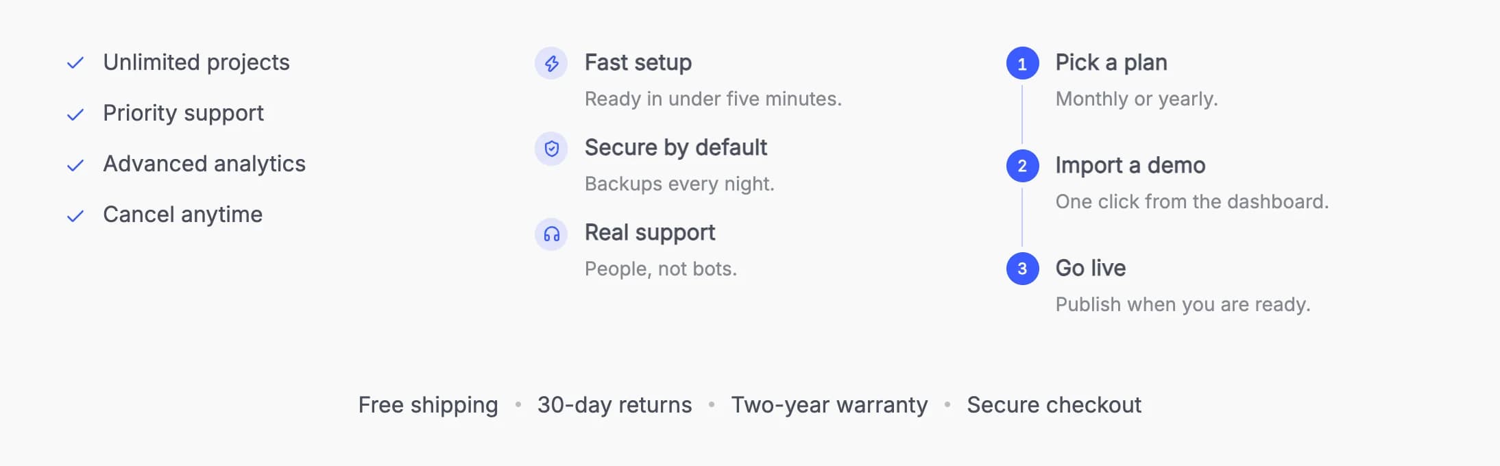
A list with a check, number, dot or any icon before each item, stacked, in columns or inline, with optional connecting lines for steps.
Icon List shows a list with a marker before each item: a check, an arrow, a dash, a dot, numbers or any icon, on its own or in a shape. Items can have a short description, a link and their own icon, and the list can be stacked, in two or three columns, or inline. With no settings changed you get a small check in the accent color before plain text, and the items fade up one after another when the list scrolls into view.
Add it
In WPBakery, click Add Element and pick Icon List from the Highend Shortcodes category. It starts with four sample items. Or use the shortcode. See Shortcode.
Items
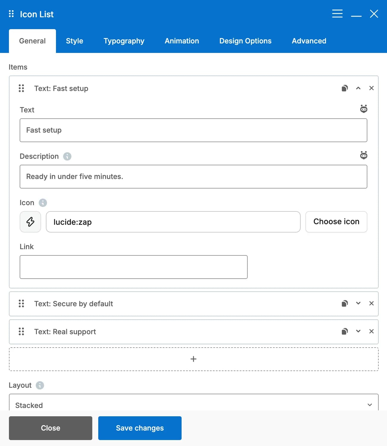
Each item in the Items group has these fields. Click + under the group to add an item, drag an item to move it, and use the icons on its right to copy or delete it. Items without text are left out.
textThe item's text.
descriptionOptional. A short line under the text, in a softer shade.
iconOptional. Replaces the list's marker for this item only. It still shows when Marker is None. See Icons for the picker.
linkOptional. Makes the whole item a link.
new_tabOpens the link in a new tab. Only shown when Link isn't empty.
Settings
StackedlayoutOptions: Stacked, Two columns, Three columns, Inline (items in a row that wraps). See On phones for how columns change on smaller screens.
DotseparatorWhat goes between inline items. Options: Dot, Slash, Line, None. Only shown when Layout is Inline.
LeftalignOptions: Left, Center, Right. A stacked list moves as a block, so its items stay lined up with each other; inline rows are aligned. Only shown for Stacked and Inline layouts.
spacingIn pixels. Leave empty for spacing that suits the layout and font size.
NonedividersLines between the items. Options: None, Solid, Dashed. Not shown for the Inline layout.
CheckmarkerShown before every item. Options: Check, Arrow, Dash, Dot, Numbers, Icon (any icon, picked in List Icon), None. With Numbers the list is a numbered list for screen readers too.
lucide:circle-checkiconThe icon before every item. Only shown when Marker is Icon.
Minimal (the marker alone)styleOptions: Minimal (the marker alone), Soft circle, Outline circle, Rounded square, Solid circle, Halo (circle with a soft ring). Shapes take a light tint of the marker color unless you pick a Marker Background. On Solid circle the icon or number turns white or dark, whichever reads better. In the minimal style, numbers below 10 get a leading zero (01, 02). Not shown when Marker is None.
Next to the first linevalignOptions: Next to the first line, Centered on the item. The difference shows for items that wrap or have a description. Not shown when Marker is None.
icon_sizeIn pixels. Leave empty to size the marker from the text, so it grows with Font Size. Not shown when Marker is None.
DefaultstrokeHow thick the lines of Lucide icons are, an item's own icon included. Options: Default, Thin, Light, Regular, Bold. Only shown for the Check, Arrow, Dash and Icon markers.
colorLeave empty for the accent color. Not shown when Marker is None.
bg_colorThe fill of the shape. Leave empty for a tint of the marker color. Not shown for the minimal style.
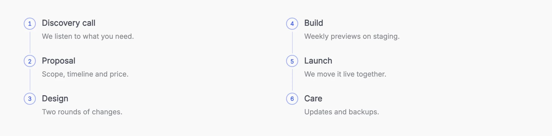
connectDraws a line from each marker to the next, for steps and timelines. It works with every marker style and size, with either marker position, and with divider lines. In two or three columns, the items then run down each column (1, 2, 3, then 4, 5, 6) and each column gets its own line. Not shown for the Inline layout or when Marker is None.
Style tab
text_colorLeave empty to use the color around the list, so a list reads on dark rows without changes.
desc_colorFor items with a description. Leave empty for a softer shade of the text.
divider_colorFor divider lines, connected markers and inline separators (all set in the General tab).
Underline draws inlink_hoverFor items with a link. Options: Underline draws in, Color change, None. With the first two, the marker also fills in or nudges on hover.
hover_colorLeave empty for the marker color. Not shown when Link Hover is None.
Typography tab
The item text's font. Markers scale with it.
Yesuse_theme_fontsUses the theme's font instead of the Google font below.
google_fontsPick a Google font. Only shown when Use Theme Font is off.
font_sizeItem text, in pixels. Leave empty for the surrounding text size.
font_size_phoneIn pixels. The size scales smoothly from this size on phones to Font Size on desktops. Leave empty to pick it automatically when Fluid Typography is on in Highend Options > Typography.
Defaultfont_weightOptions: Default, 300, 400, 500, 600, 700, 800.
letter_spacingIn em, relative to the font size, for example -0.02 or 0.05.
Defaulttext_transformOptions: Default, None, Uppercase, Lowercase, Capitalize.
Animation tab
Fade up, one after anotherentrancePlays when the list scrolls into view. Options: Fade up, one after another, Slide in, one after another, Check off: markers pop and draw, then the text, None. Visitors who prefer reduced motion see the list right away.
70staggerIn milliseconds, up to 1000. Not shown when Items Entrance is None.
entrance_delayIn milliseconds, before the first item. Not shown when Items Entrance is None.
Common settings
Icon List has a CSS box in the Design Options tab and an Extra class name field in the Advanced tab. See the Elements overview. Instead of the usual Entrance Animation, it has the Items Entrance above.
On phones
- Two columns and Three columns stack into one column on phones (below 768px). Three columns become two on tablets (768 to 1023px).
- Connected markers in columns become one list with one line on phones, in the same order.
- Inline items wrap onto more rows as the screen narrows.
- Long words wrap in narrow columns instead of overflowing.
Shortcode
[hb_icon_list marker="number" style="solid" connect="yes" items="%5B%7B%22text%22%3A%22Pick%20a%20plan%22%7D%2C%7B%22text%22%3A%22Go%20live%22%7D%5D"]items holds the items as URL-encoded JSON, the way WPBakery saves them: each item is an object with text and, optionally, description, icon, link and new_tab (yes). It's easiest to build the list in WPBakery and copy the shortcode from there. Icons use the same values as the icon picker, for example lucide:check or hb-moon-heart. See Icon values.
The older [list] and [list_item] shortcodes still work as before. See List.