Icon
A single icon from small to display size, on its own or in a shape, with hover effects and lines that can draw themselves.
Icon shows one icon, from small to display size, on its own or in a circle, a rounded square, an outline or a halo. Lucide icons are drawn with lines, so they stay sharp at any size, keep fine lines as they grow, and can draw themselves line by line when they scroll into view.

Add it
In WPBakery, click Add Element and pick Icon from the Highend Shortcodes category. Or use the shortcode. See Shortcode.
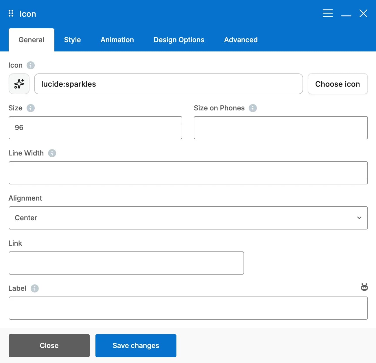
Settings
lucide:sparklesiconClick Choose icon to pick from Lucide, IcoMoon or FontAwesome, or type a value. See Icons.
64sizeIn pixels, from 16 to 160 or more. A large icon and its shape shrink to fit a narrower column, at any screen width.
size_phoneIn pixels. The size scales smoothly from this size on phones to Size on desktops. Leave empty to scale it automatically when Fluid Typography is on in Highend Options > Typography.
strokeIn pixels, for example 1 for hairlines. Leave empty to keep lines fine as the icon grows: 2px at 24px, about 3px at 64px, 5px at 150px. Outline shapes match it. Only shown for Lucide icons.
LeftalignOptions: Left, Center, Right.
linkOptional. Makes the icon a link.
Same windowtargetOptions: Same window, New window. Only shown when Link isn't empty.
labelWhat the icon means, for screen readers, such as "Free shipping". Leave empty when text next to it says the same. A linked icon uses it as the link's name; without a label, the link is named after the icon.
Style tab
NoneshapeOptions: None, Circle, Rounded square, Circle outline, Rounded square outline, Halo (circle with a soft ring). Shapes take a soft tint of the icon color unless you pick a Shape Background. Outlines are as thick as the icon's lines.
paddingSpace around the icon, in pixels. Leave empty for half the icon size (a little more for the halo). Not shown when Shape is None.
radiusIn pixels. Only shown for Rounded square and Rounded square outline.
Roundcorner_shapeHow the rounded corners are drawn. Options: Round, Squircle, Soft squircle, Bevel (cut corners), Scoop (inward curve), Notch (inward square). Browsers without corner shape support show normal rounded corners. Only shown for Rounded square and Rounded square outline.
colorLeave empty for the accent color.
bg_colorLeave empty for a soft tint of the icon color (outlines stay clear). Not shown when Shape is None.
border_colorLeave empty for a lighter shade of the icon color. Only shown for the outline shapes and the halo.
NonehoverOn hover of the icon or its link. Options: None, Lift, Pop, Fill the shape (the shape fills with the color and the icon turns white or dark, whichever reads better; without a shape, a circle fills in behind the icon), Redraw the lines (Lucide) (font icons pop instead).
hover_colorThe icon color on hover, and the fill of Fill the shape. Leave empty to keep the icon color. Only shown when Hover Effect isn't None.
Animation tab
drawWhen the icon scrolls into view, Lucide icons draw themselves line by line and font icons fade in. Visitors who prefer reduced motion see the icon right away.
Normaldraw_speedOptions: Quick, Normal, Slow. Only shown when Draw In is on.
NoneanimationThe theme's entrance animations. See the Elements overview.
animation_delayIn milliseconds, for example 300. Delays the entrance animation and the drawing.
Common settings
Icon also has a CSS box in the Design Options tab and an Extra class name field in the Advanced tab. See the Elements overview.
Lucide or font icons
Both work in every setting. The differences:
- Lucide icons are drawn with lines. Line Width and Redraw the lines apply to them, and Draw In draws them line by line.
- Font icons (IcoMoon and FontAwesome) are solid shapes. Line Width is hidden for them, Draw In fades them in, and Redraw the lines makes them pop instead.
Shortcode
[hb_icon icon="lucide:rocket" size="48" shape="circle" hover="fill"]Older icon shortcode
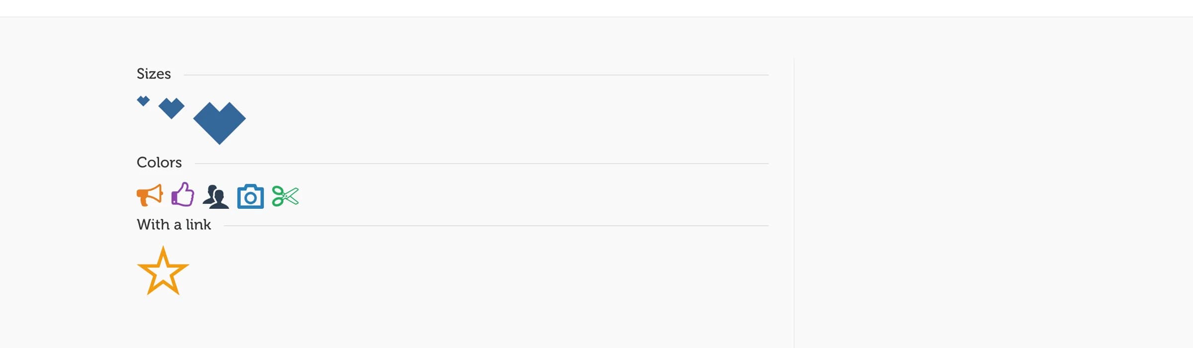
The [icon] shortcode from earlier versions still works and has no WPBakery element. Type it directly, or use the Highend Shortcode Generator button in the Classic Editor toolbar, which opens an Icon form with the same fields. It takes icon font names only (icon-* for FontAwesome, hb-moon-* for IcoMoon), which you can look up on the Icons admin page.
Prop
Type
[icon name="hb-moon-heart" size="large" color="#e74c3c" float="left"][icon] is self-closing: it takes no content.